
Google has completely transformed the look and functionality of the Gemini app
Google Unveils Updated Gemini Design
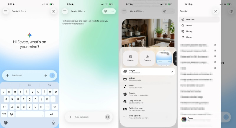
Over the past few months, Google’s team has been working on a new visual look for the Gemini app. The results of these efforts are now visible.
What Changed on the Home Screen
* The input field now has rounded edges, with voice request and Gemini Live icons on the right side.
* A “+” symbol appears to the left of the field, opening a menu that enables camera use and access to the Photos section.
* The bottom panel contains buttons for Files, Notebooks, and More Downloads.
New Tools
Below the input line are features such as:
- Images
- Video
- Music
- Canvas
- In‑Depth Exploration
- Guided Learning
Google first tested this unified interface on the Android app and the PC web version. The Gemini macOS release already implements it fully.
Central Screen Design
* A greeting appears in the center, with the Gemini logo above it.
* The background has noticeably changed: it now pulses in bright colors with a gradient effect.
Model and Account Management
* The toggle for available AI models returned as a dropdown menu located in the top left corner.
* The updated set of icons features thin rounded outlines.
* The account switching menu moved below the navigation block.
* In chats, the “View Reasoning Steps” option is now in an additional submenu.
iOS Version Specifics
For iOS, developers actively applied Liquid Glass design elements, giving the app a smoother and more translucent look.
Testing Continues
At present, the updated interface is available to a limited number of users. It is expected to be rolled out more broadly after the testing phase concludes.
 Asted Cloud
Comments (0)
Share your thoughts — please be polite and stay on topic.
Log in to comment