
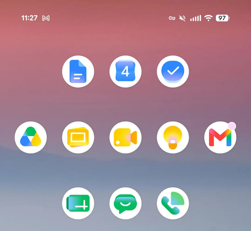
Google updated the Workspace app icons with the "Gemini Era" theme.
Google Updated Workspace Logos Worldwide
Starting May 18, Google began a global redesign of its Workspace app icons—including Android, iOS, and web versions. The new graphic solutions are based on the Gemini Era concept and aim to make shortcuts more recognizable on mobile screens.
| Platform | Release Date | What Changed |
|---|---|---|
| Web | May 18 | First changes – web‑version logos |
| iOS | May 26 | Updates applied to all Workspace apps |
| Android | By end of May | Completed with Gmail; other services received new icons last week |
List of Apps with New Logos
- Google Calendar
- Tasks
- Chat
- Meet
- Google Drive
- Google Docs (Docs)
- Slides
- Sheets
- Keep
- Voice
Additionally, the icons for Google Forms, Sites, and Vids were updated.
Features of the New Logos
* Gmail kept its original shape but added a richer red color for better visibility. The status‑bar icon remained unchanged.
* Most Workspace services now use only one primary shade.
Exceptions:
* Drive – uses a combination of three colors.
* Gmail – employs all four Google brand colors.
Context
The update is part of a series of changes that have already affected other company products: Google Search, Gemini, Google Home, Google Photos, Maps, Wallet, and Health. It is part of the strategy to transition to a unified visual style for the Gemini Era and strengthen brand recognition on mobile devices.
 Asted Cloud
Comments (0)
Share your thoughts — please be polite and stay on topic.
Log in to comment