
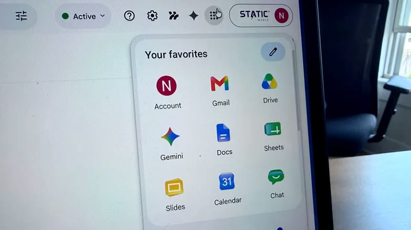
Google released a major update to its service icons, making them more personalized
Google Updates Icons for Its Services
The company Google announced a global redesign of the icons that accompany its core products. The new icons replace an outdated set created five years ago and are intended to make them more recognizable and user-friendly.
When the update began
Deployment started one day before Google I/O, the annual developer conference. According to Engadget, the first new icons are already visible in the app switcher menu of Gmail’s web version and in some iOS mobile clients. However, they have not yet been applied across all services: when opening “Google Drive” or “Calendar,” many users still see the old design.
Why it matters
Five years ago Google unified the look of its products by replacing unique logos with outline images in four brand colors. This decision drew criticism for losing individuality: the icons became hard to distinguish from one another.
The first step toward fixing the situation was taken a few months ago—an update to the “Google Maps” icon that added extra visual depth while retaining the familiar palette. The new icons continue this trend and blend harmoniously with Google’s recently introduced 3D emoji as part of the Android 17 announcement.
What’s next
It is expected that the company will reveal more detailed information about the extensive visual overhaul during the upcoming I/O event.
 Asted Cloud
Comments (0)
Share your thoughts — please be polite and stay on topic.
Log in to comment